Rebranding
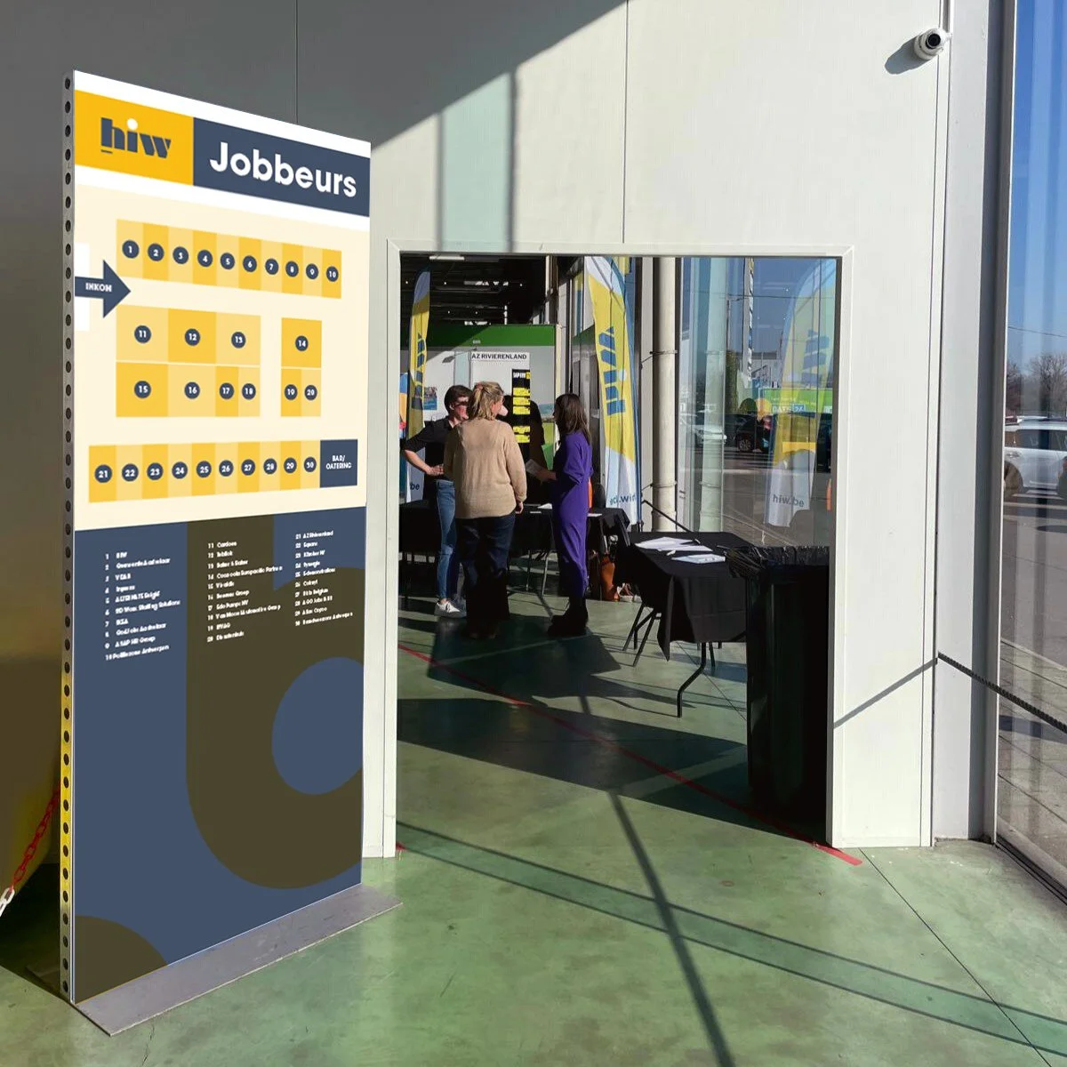
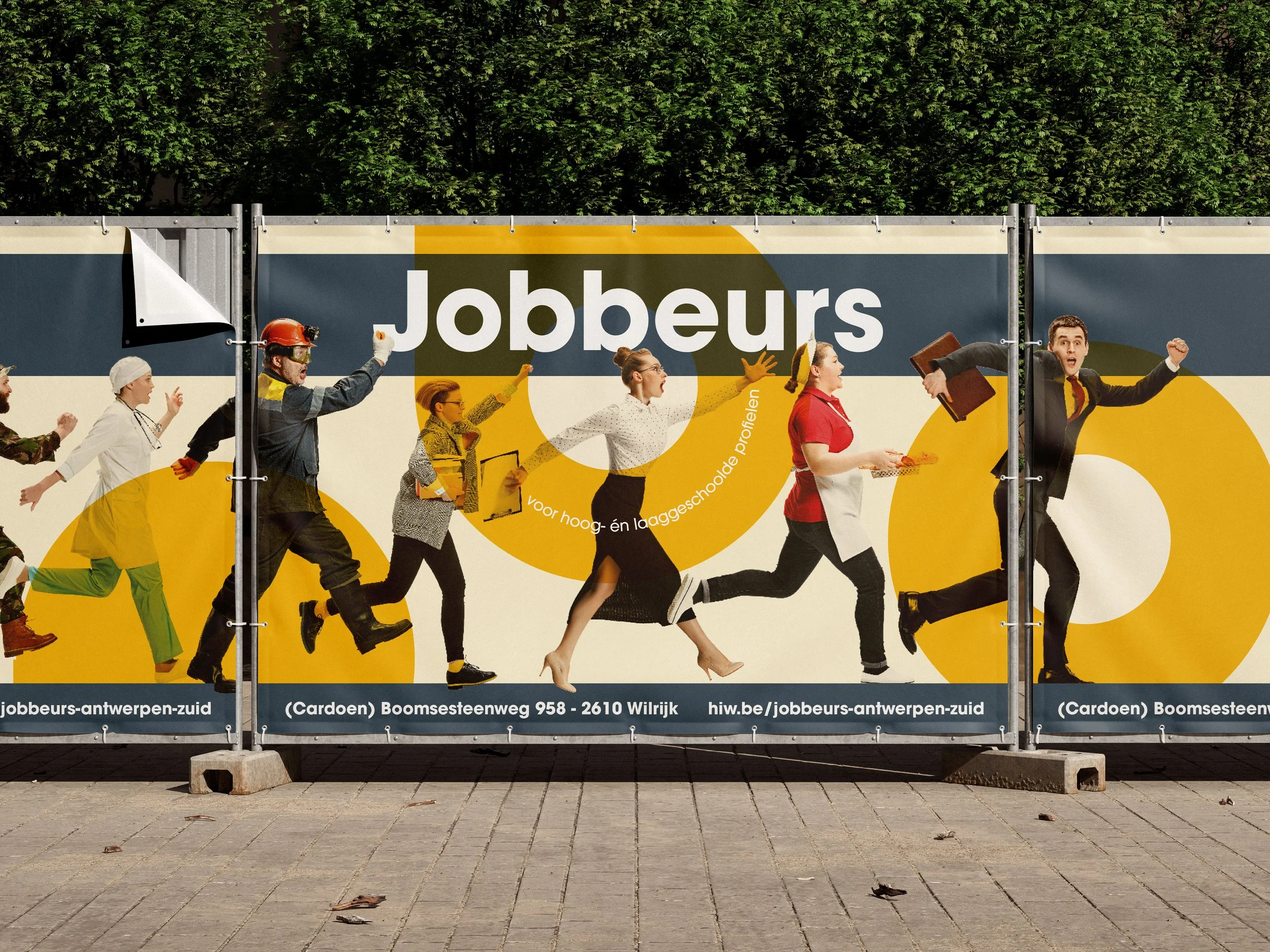
Handel & industie Wilrijk (trading industry Wilrijk) is a business association. They inform and connect local businesses, host job fairs and organize networking moments for their partners.
Despite their long-standing presence, HIW was not very well-known in the wider area. They needed a new brand to unify their look and feel as they wanted to attract new businesses. The new strategy should bring a sense of community and convey their core values clearly.
GRAPHIC DESIGN / BRANDING / STYLE GUIDE / ART DIRECTION
STYLE Trustworthy / Optimistic / Community building
CLIENT Made while employed by Flex Print Solutions
PHOTO Victor G, Christopher Burns
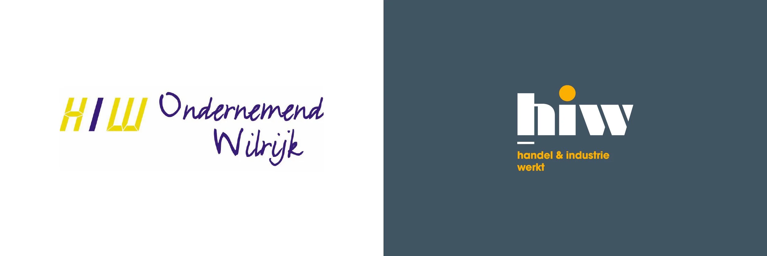
old logo
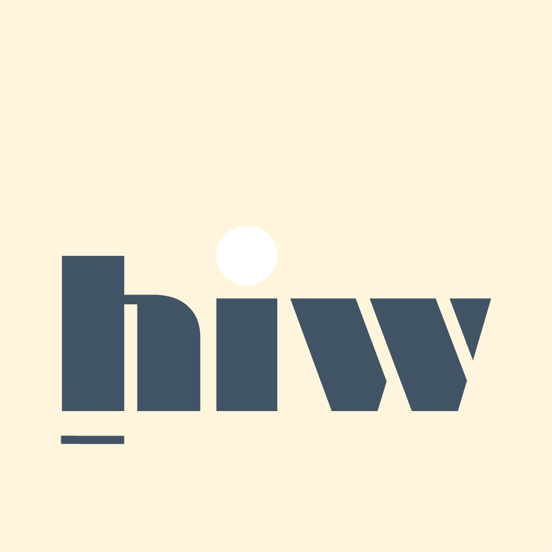
new logo
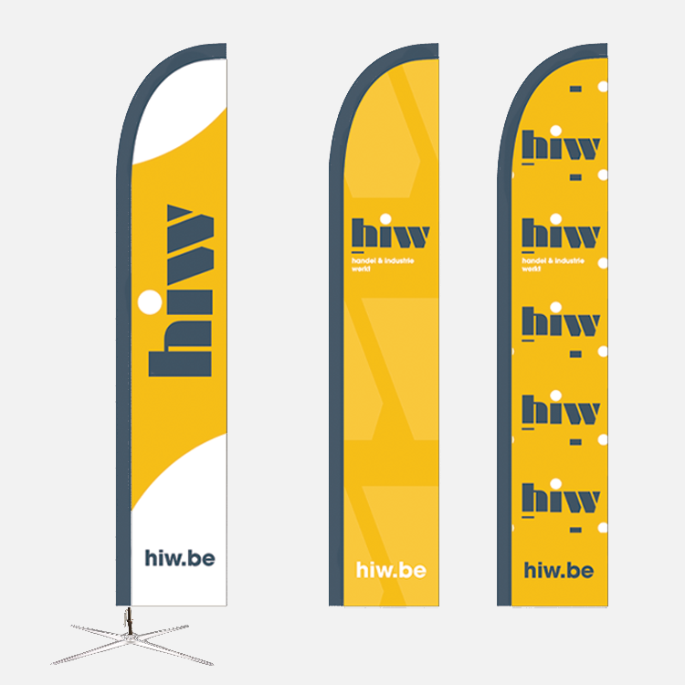
Brand identity
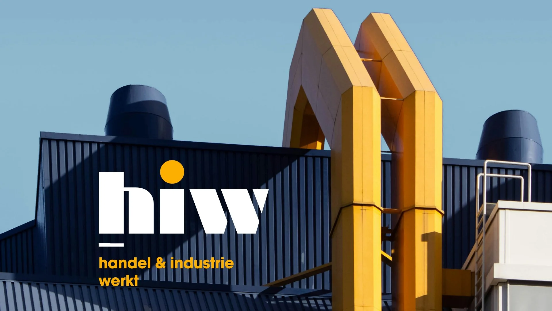
The color palette and visual system reflects HIW’s secure structure. Slate blue and warm, inviting yellow were chosen as the primary colors, representing stability, trust and positivity.
The logo was redesigned to convey a more modern, trustworthy feel while still maintaining a sense of playfulness. It features a modernist font with clean lines, representing strength and professionalism. The emphasis on the “i” represents HIW’s role as an important source of information for its members. The dot represents the meeting space they provide.
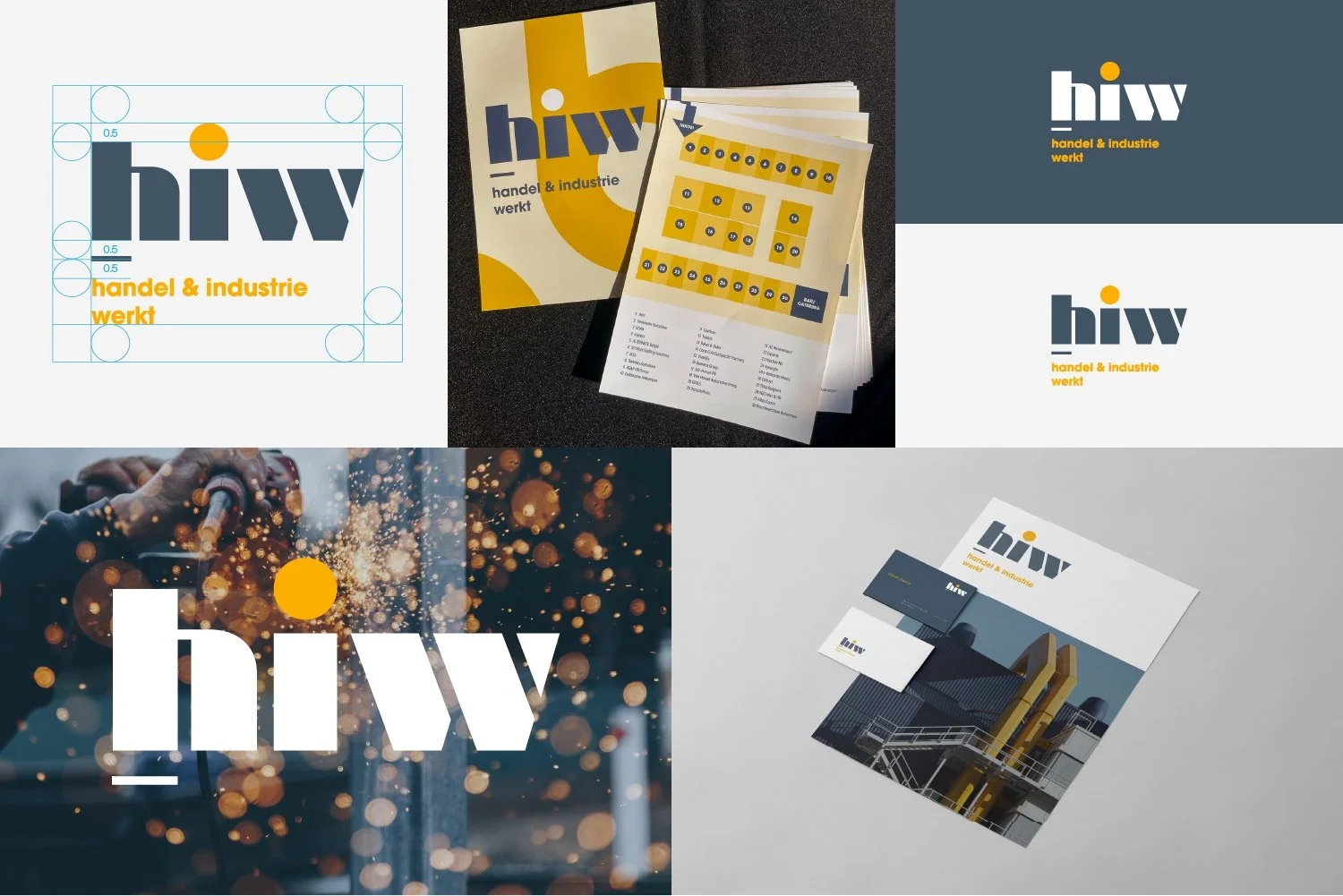
Brand expression
The tagline “Verbinden Informeren Versterken ” (Connecting, Informing, Strengthening) was added to reinforce the message of community and collaboration within HIW. It encapsulates their core value of strength through unity and resonates with both existing and potential members.